The Final Post

Ah yes. The semester is finally almost over and I’ll finally be done with this class. Just joking.

So this class is definitely not what I thought it would be. When selecting an english course all I was looking for was a class that fulfilled my last gen ed english requirement and didn’t deal with old literature. Well, I at least got half of that. While requirement wise, I did not get anything out of this class, I thoroughly enjoyed all the work we did. Coming into the semester I thought “Writing for the Web? Like writing for websites or online newspapers? I guess they’re different?”. So I really had no idea what I was getting myself into.

What the class ended up being though is completely different. Website building, video, photo, and audio editing, while completely opposite from what I thought I would be doing, I thoroughly enjoyed all of it. Especially the video editing, so I’d have to say that was my favorite project from the class. This has definitely been the class I enjoyed the most this semester because I enjoyed being able to sit down for a couple hours at a time, listen to some music, and create something that is my own. And that feeling of creating something original, that you came up with, and then knowing enough to actually make it, is a fantastic feeling.

I definitely recommend this course to another student because I see the benefits from it, even if you aren’t going into a career in media production. I’m not. As long as the course description is a little longer than “writing for the web”.

How to Lay Audio Behind a Voice

In your audio piece, there’s probably a point where you want to lay music behind your voice. This will show you how to do that.

Step One: Select the section of music that you want to fade when you are speaking.

Screen Shot 2017-04-24 at 10.43.14 AM


Step 2: Select the envelope buttonScreen Shot 2017-04-24 at 10.42.49 AM

Step 3: Place a keypoint where you want to the audio to start to fade and where it will return to normal volume.Screen Shot 2017-04-24 at 10.45.19 AM

Step 4: Set two keypoints further in that mark the lowest points the audio will get.Screen Shot 2017-04-24 at 10.45.28 AM

Step 5: Then drag the two inner points down to an equal level.Screen Shot 2017-04-24 at 10.44.44 AM

Step 6: Check the audio and adjust if needed.

This video helped me learn this technique

Analysis of “Lament for Joe Hall”

I decided to analyze the audio for “Lament for Joe Hall” because I really enjoyed the way that additional audio sources were added into the storytelling. First off, having the story be told from the point of view of the child, and then be voiced by a child is just amazing. It immerses the audience into the story in a way that could not be achieved by having the story be told from the creator. In addition to that, third party audio sources greatly contribute to the storytelling effort. Audio files of sound effects like police sirens, as well as audio taken from a 60 Minutes story really bring the piece together. The piece opening with the sirens gives the audience their first question, which is “Why?” It leaves the audience craving for the details of the story and wanting to learn about the people involved and what happened. To a person unfamiliar with the story, the voice of a child gives a sense of innocence to the story being told, until the story reaches its climax. There was already a noticeable tension with the increasing amount of detail, however, there is still a substantial amount of felt shock and surprise at the climax. These audio elements combined together create a story that is attention grabbing, conveys feeling to the audience, and keeps the audience asking questions.

Moving Around an Image Using CSS

I used this technique to adjust where the Creative Commons License sits on my page. When first copying in the code, it automatically places itself (the button and text) in the bottom left-hand corner of your page. I wanted it to sit in the top right-hand corner of my page, so this technique will show you how to do that.

Step One: Put in the code for the button or image into your HTML into a Div. Assign this div an id, which will be its “name” referenced in css. Since I was placing the license my div’s id is “cclicense”.

Screen Shot 2017-04-04 at 2.30.19 PM

Press enter and then insert the code for your image. My code shows up as a link because it’s a button, however your code will be for an image most likely.

Screen Shot 2017-04-04 at 2.33.05 PM.png

After this, make sure to close your div and then we move over to css.

Screen Shot 2017-04-04 at 2.35.54 PM

This is your css code. To interact with your div id, use a pound/hashtag and then your id name. Set your position to absolute and then your distances from the left, right, top and bottom margin are up to you. It’s important to keep in mind that the distances are FROM the margin. So when it is “right: 20px;” it is moving the image 20 pixels away from the right margin, not right 20 pixels from its original location. The same principle applies when setting the distance from the other margins.

Blog Post #7: Moon #2 – Apollo 11

giphy

The website I chose is http://moon2.kedzich.com/, which is a website dedicated to the NASA moon missions. Depending on whether you change the number next to “moon” in the URL, you are taken to a different mission. I’m currently on the Apollo 11 page, the mission that first landed men on the moon. I love the simplicity of the website. There is no need to click on different drop down menus or links to access different parts of the website- simply just keep scrolling. Scrolling also provides the information in chronological order for the certain moon mission being viewed. In a website designed to share information, complexity is needed. You do not want people skipping all around the site, potentially confusing themselves because they did not view it in the right order. When entering the site, you intuitively scroll downward and are provided the information in the order designed to be viewed in. Large text, contrary to thought, is often a small, interesting, detail. Photos and their captions are imbedded along the way, and most of the information is given in blocks of paragraphs of text. Imbedded are various recordings, videos, photos and gifs to provide context to the information being discussed. While there are snippets of bright, colored text, most of the site is black text on a white background or white text on a black background or photo. The site stays true to its simple design roots. The website is clearly designed to inform, so a lack of complexity lends itself to this goal. Information is easy to gather as well because of the chronological order of the information. What I take away from this website is KISS, aka, Keep It Simple Stupid. You don’t need a fancy and complex website to achieve your purpose. Simplicity, or at least something that looks simple, should be the goal.

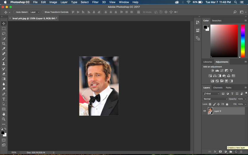
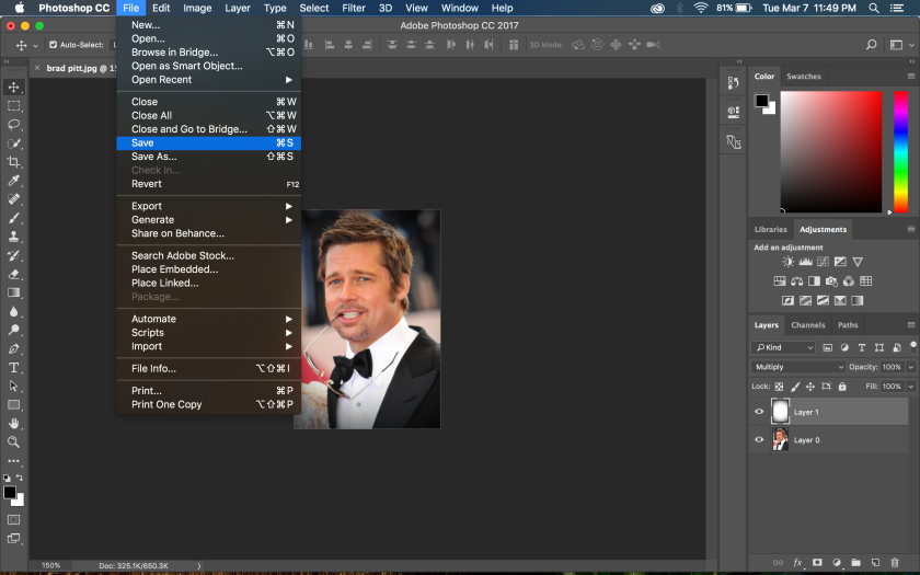
Photoshop DIY: How To Create a Vignette Effect

Screen Shot 2017-03-07 at 11.48.16 PM

Step 1: In the lower right hand corner, click on the “create a new layer button”.

Screen Shot 2017-03-07 at 11.48.29 PM

Step 2: Selecting this new layer, go to “Edit” -> “Fill”

Screen Shot 2017-03-07 at 11.48.36 PM

Step 3: Change contents to “White” and then click ok.

Screen Shot 2017-03-07 at 11.48.46 PM

Step 4: Go to “Filter” -> “Lens correction”

Screen Shot 2017-03-07 at 11.48.52 PM

Step 4: Select the “custom” option instead of the “auto correction”

Screen Shot 2017-03-07 at 11.48.57 PM

Step 5: Here, move the vignette slider all the way to the left so the value reads -100 and click ok.

Screen Shot 2017-03-07 at 11.49.06 PM

Step 6: Go to your blend options and change the setting from “normal” to “multiply”

Screen Shot 2017-03-07 at 11.49.41 PM

Step 7: Now your vignette effect is complete and you’re free to save!

The “key” to Remembering Hardware

keys

I decided to select the photo of the rack of keys from the photo essay “Remembering Hardware”. What I really enjoyed about this photo was the combination of a close up shot, with a relatively shallow depth of field. The depth of field accomplishes two things. First, the keys in focus help bring attention to the details of the keys. They are all a little bit different, with minute changes in their size or design. Second, the keys out of focus help bring a feeling of a vast amount of keys hanging on the wall. It just is not one row of these keys. There are multiple rows, and so many that all of them could not be fit in the photo and they are out of focus. The effect of this adds to the story of Mr. Kramer, as it supports that he knows everything about anything in his store. This shot helps add to the intimacy of the story. The parallel rows of keys are an example of “leading lines” which draw our eyes along a path through the photo. As you “journey” through the photo, the details of all the keys come out more. In addition to this, the use of symmetry of the parallel lines of keys helps add to the photo. It is a bit of a contradiction; while the keys are symmetrical in their organization, they are anything but when examined individually. It adds a focal point to the scene: the keys, which again is used to draw the viewer to notice the detail in the keys.

The intimacy between Mr. Kramer, and all the different various tools and knick knacks scattered around the store is described through this photo. Mr. Kramer does not just know what is in the store, he knows exactly where it is and what it looks like. It helps add to the “legend” of him. The keys are a perfect example to use because they are both something simple and common, a key, and something that is uncommon because of their detail. The photographer could have choosen another object that is uncommon in the store, but it would not have had the same effect. If there is nothing else like it, of course he is going to remember where and what it is. To have the effect of intimacy, the contrast between the common and the uncommon needed to be made. It is not one single detailed key, it is dozens and dozens of keys hanging on hooks that are all a little bit different.

The image fits right into the story line. Right before this image, the photo essay had just told about when he took over for his father as the owner of the hardware store. This photo is perfectly placed because it shows the reader of the essay how seriously he took the task of taking over for his father. He really took it to heart and loved doing what he was doing. While it could have had a similar effect at the beginning, to get the full designed effect of the photo, you need it right after the circumstances of him taking over the hardware store.