Final Blog Post

From my work this past semester I’d have to say the idea of copyright halts creativity. People who copyright are selfish and only want their work linked to their name; when in reality allowing their work to be remixed into something new would allow that work to be constantly repurposed. Who wouldn’t want to see their work become something new? Having work that has the potential to be repurposed and reused over and over can only be taken as a huge compliment, right? Every project I created this semester has incorporated something that had already existed. Even in the short film “A Brief History of John Baledessari” there were brief images and maps that’s obviously didn’t belong to him, but were still included because it is a part of his story. A huge majority of images, audio, and film will not belong to us, but are apart of us, and could help tell our story. Nothing should belong solely to one person, one group of people, or one corporation. This kind of ownership creates limitations in how we can express ourselves.

Another part of the semester that really sticks out to me is Ira Glass’s words on the power of the anecdote. “There’s a guy and he wakes up, and he’s lying in bed and the house is very, very quiet, unearthly quiet. He put his feet on the floor and walks to the door of the bedroom, and again very, very quiet. Walks downstairs and looks around, its just unusually quiet.” Ira Glass is trying to make the point that you could take something like this, a very simple, boring story and create suspense and momentum that makes it that the listener or reader wants to hear more. Being a good writer is having that skill to make the most boring story something that people still feel intrigued by.

Blog #10: DIY Remove Background Noise

  1. Highlight a section of the recording where no obvious sounds are made.Screen Shot 2017-04-24 at 2.17.36 PM
  2. Select “Effect” and hit on “Noise Reduction” in the menu options.Screen Shot 2017-04-24 at 2.18.51 PM
  3. Click on “Get Noise Profile”Screen Shot 2017-04-24 at 2.19.16 PM
  4. Now highlight the entire recording from start to end.
  5. Select “Effect” and “Noise Reduction” again, but this time hit “OK”. Screen Shot 2017-04-24 at 2.20.34 PM

Blog #8: DIY – Links

We did have a tutorial to read on links, but I was having difficulty with it so I thought I’d dumb it down even more for everyone (because hopefully I wasn’t the only one having problems).

  1. I decide I’d like to have a link called “Citizen Project” and when you click on it, it will take you to the Vimeo page where my citizen project is.
  2. First, this will be the basic setup of it. <a> is the link tag so use this whenever you need to have a link.Capture
  3. Then, you will copy the website address you want in between the quotations. The website text will not be visible, just the area where “CITIZEN PROJECT” is now. Capture2.PNG
  4. Finally, save and upload it to your website, DO NOT JUST PREVIEW IT. Preview will not allow you to test your link and you might think you did it wrong. You have to upload your HTML and CSS files and then your link will work and go to the right website.
  5. If you are using a different area of your website you can just use a local link and not the full web address.

Blog Post #7: CSS Conf

Screen Shot 2017-03-13 at 12.12.26 AM

https://2016.cssconf.com/#about

This website is one that immediately jumped out at me because of the bright, flashy colors. This makes sense because the conference it is advertising is one for designers, developers, and engineers that create the most engaging interfaces. It says at the conference they will be discussing the latest technologies, which one can assume is being put to use here on this interface.

Visually, this website is very nice to look at. Is doesn’t leave the eyes feeling bored, and yet it’s not too much and cluttered looking. Navigation is simple and very user friendly. Everything on the website is on the homepage, but if you click any of the three links on the top right corner of the page it brings you to that specific section.

Do you think having everything on the homepage is a pro or con?

I’m assuming this design is not easily achieved, but I think the hard work is worth it. It would make any designer, developer, or engineer want to go to this conference to see how a layout like this one is achieved. The website itself is one we, as a class, can use as a resource when creating our own website because it has YouTube videos posted when you scroll down the homepage.

This website caught my eye right away, proving the people holding this conference know how to design a website that will grab ones attention and lure them in to explore. I want my website to be different like this one, and incorporate bright, bold colors and shapes.

DIY Photoshop: Dodge and Burn tool to get sparkling eyes

  1. Open your file in Photoshop. Screen Shot 2017-03-07 at 6.45.53 PM
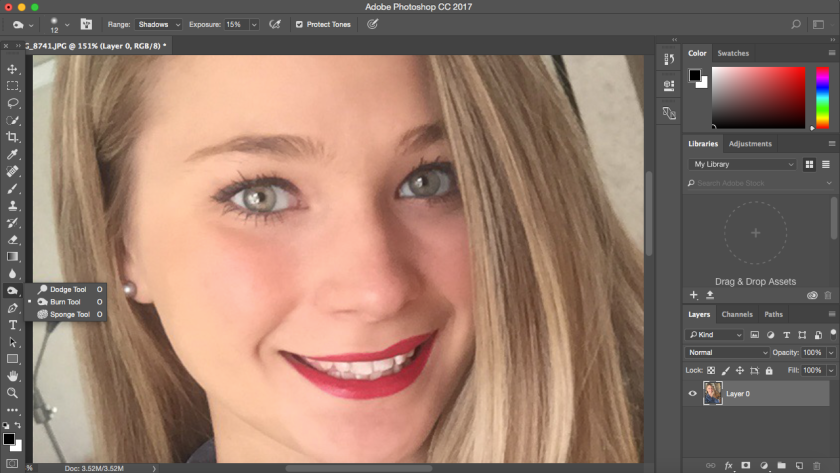
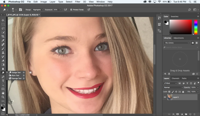
Use the “Dodge” tool on the Iris/eye color area (Brush size: similar to width of iris. Brush hardness: 10%. Range: Highlights. Exposure: 20%) You can also use it in the reflection areas of the eyes.
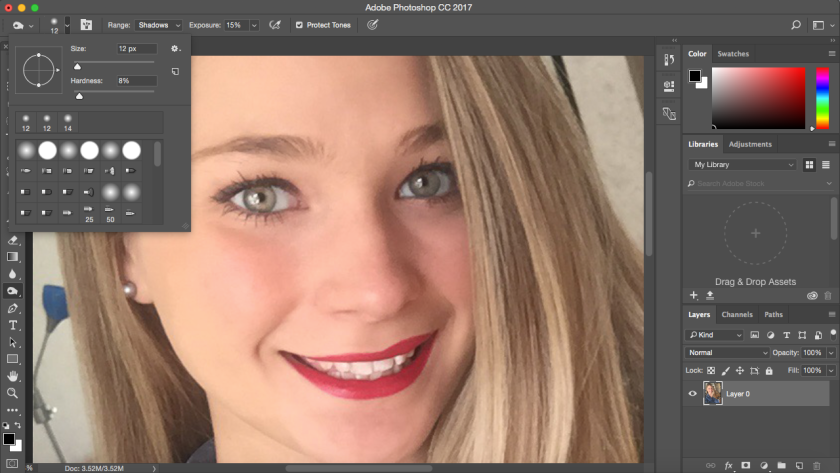
Screen Shot 2017-03-07 at 6.50.08 PM
  2. Use the “Burn” tool on the outer edge of the Iris, pupil, and across the eyelashes. (Brush size: Same size as before. Brush hardness: Around 8%. Range: Shadows. Exposure: 15%)Screen Shot 2017-03-07 at 6.51.09 PM.pngScreen Shot 2017-03-07 at 6.53.02 PM
  3. Before and after!

Remembering Hardware: Photo #11

32491873

This is a medium shot becauase it includes Mr. Kramer and his surroundings. This photo seems to break the rule of thirds by positioning Mr. Kramer almost directly in the center. But it could also be that the action of him opening the dishwasher is supposed to be the important element in this photo. There are many leading lines in this photo, all leading towards Mr. Kramer. The viewpoint is almost eye level, but seems to be lower and aligns with the height of the counter top. The background is of Mr. Kramer’s kitchen, and helps give a setting of where he lives. The photo has a lot of depth, the foreground being the countertop and the objects on it. The middle ground being the dishwasher and Mr. Kramer, and the background being the door. Their might be a little bit of natural framing occuring in this photo but not much.

I love this photo because it’s the 11th photo out of 15 and it’s the first time Mr. Kramer’s developmental disabilities are mentioned. The whole story seems to be about Mr. Kramer’s normal life. He’s a very good worker and knows everything there is to know about his job. The photo essay wants to convey that although he has a developmental disability he’s like anyone else. If anything, he’s a better, more responsible worker than most people are.

I think this photos rhetorical strategy is mainly pathos. It is appealing to emotion, although Mr. Kramer has a developmental disability he is just like us, doing an everyday chore like loading the dishwasher. Up until this point the viewer is left in the dark about this disability, and has no idea from the pictures. The viewer is left feeling a connection to Mr. Kramer, and happy he’s able to live a normal life while having a disability. Mr. Kramer gained my respect and admiration through this photo essay.